Expense Management Marketing Campaign
Project Overview
This project aimed to design display ads for a marketing campaign promoting a “seamless travel experience” and “no expense reports” targeted at business travelers. The campaign's goal was to increase brand awareness and drive conversions by highlighting the ease and efficiency of the Navan expense management solution.
Challenge
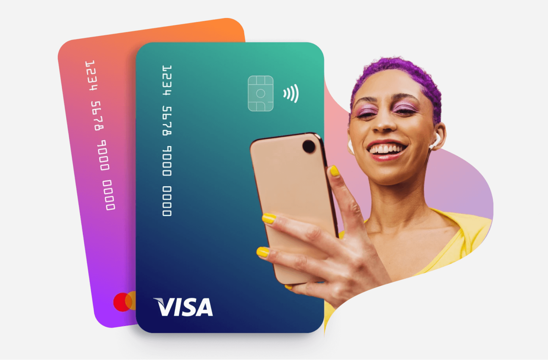
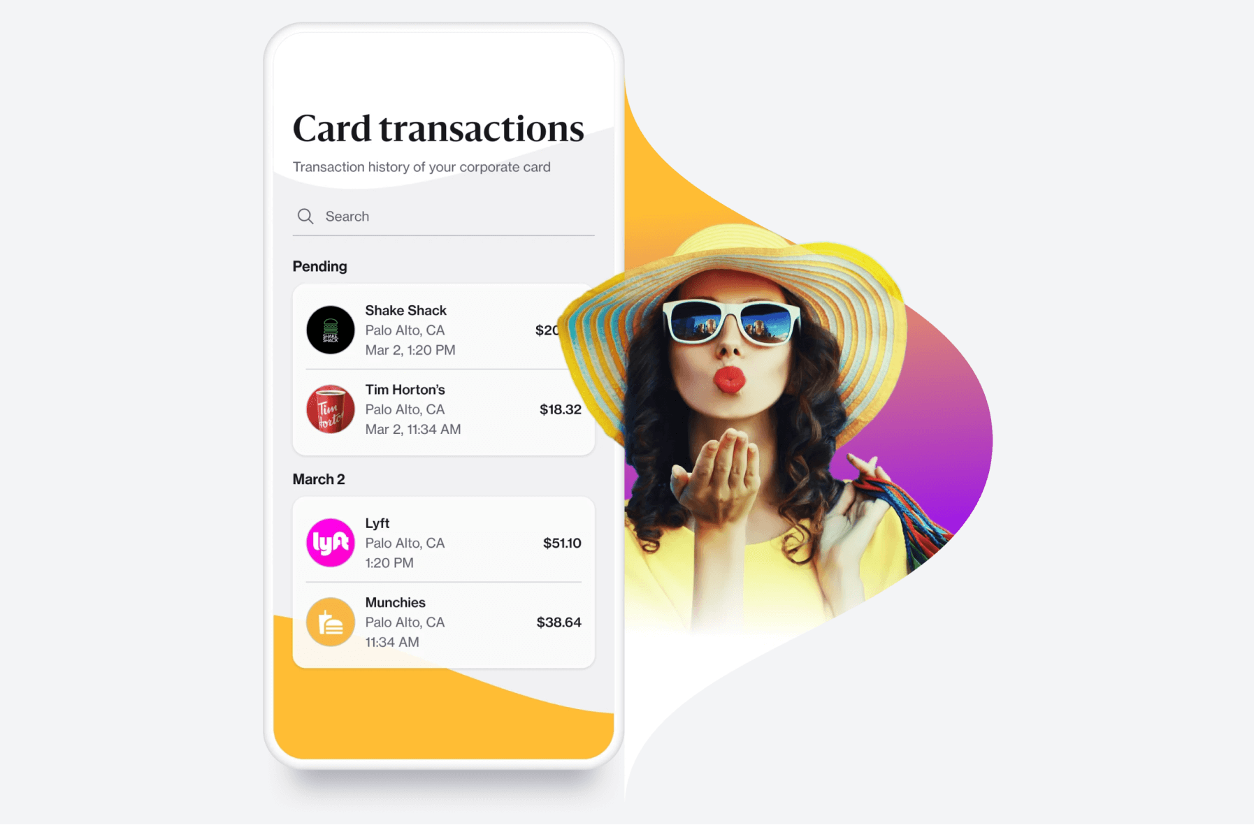
The existing graphics did not effectively convey expense management in a clear and engaging manner. The objective was to develop new marketing graphics that captivate the audience
and effectively communicate the message of Navan’s expense management app. Simultaneously, the goal was to evolve the brand's visual language and develop a comprehensive visual assets library.


Target Audience
The campaign targets business travelers who face pain points such as managing their expenses, organizing receipts, manually submitting expense reports, and dealing with unclear policies. Their goal is to focus on their trip and business objectives, and their need is an automated expense management solution.
Analysis and Insights
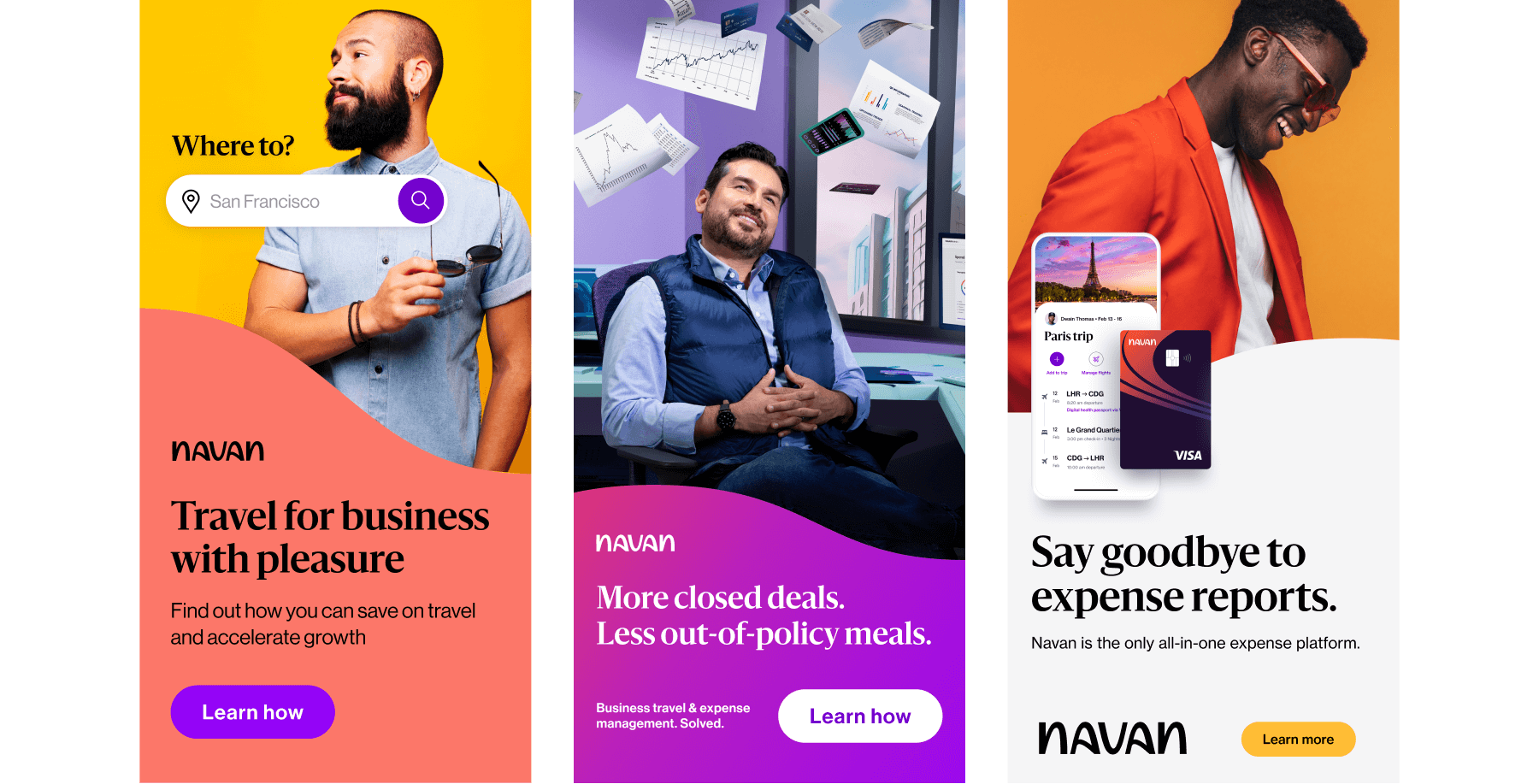
I reviewed past display ads to identify their strengths and weaknesses, enabling me to make informed improvements. The evaluation revealed that the visuals focused heavily on the aesthetics of the individuals, which detracted from clearly conveying the expense management solution. However, the images effectively communicated user satisfaction, aligning well with the overall experience Navan aims to provide for its users.
The use of bold and bright colors was eye-catching and conveyed energy and enthusiasm. The high contrast between background and foreground elements helped key features stand out and grab attention. The typography was modern, clean, and easy to read. The design also incorporated layered elements, creating depth and visual interest.
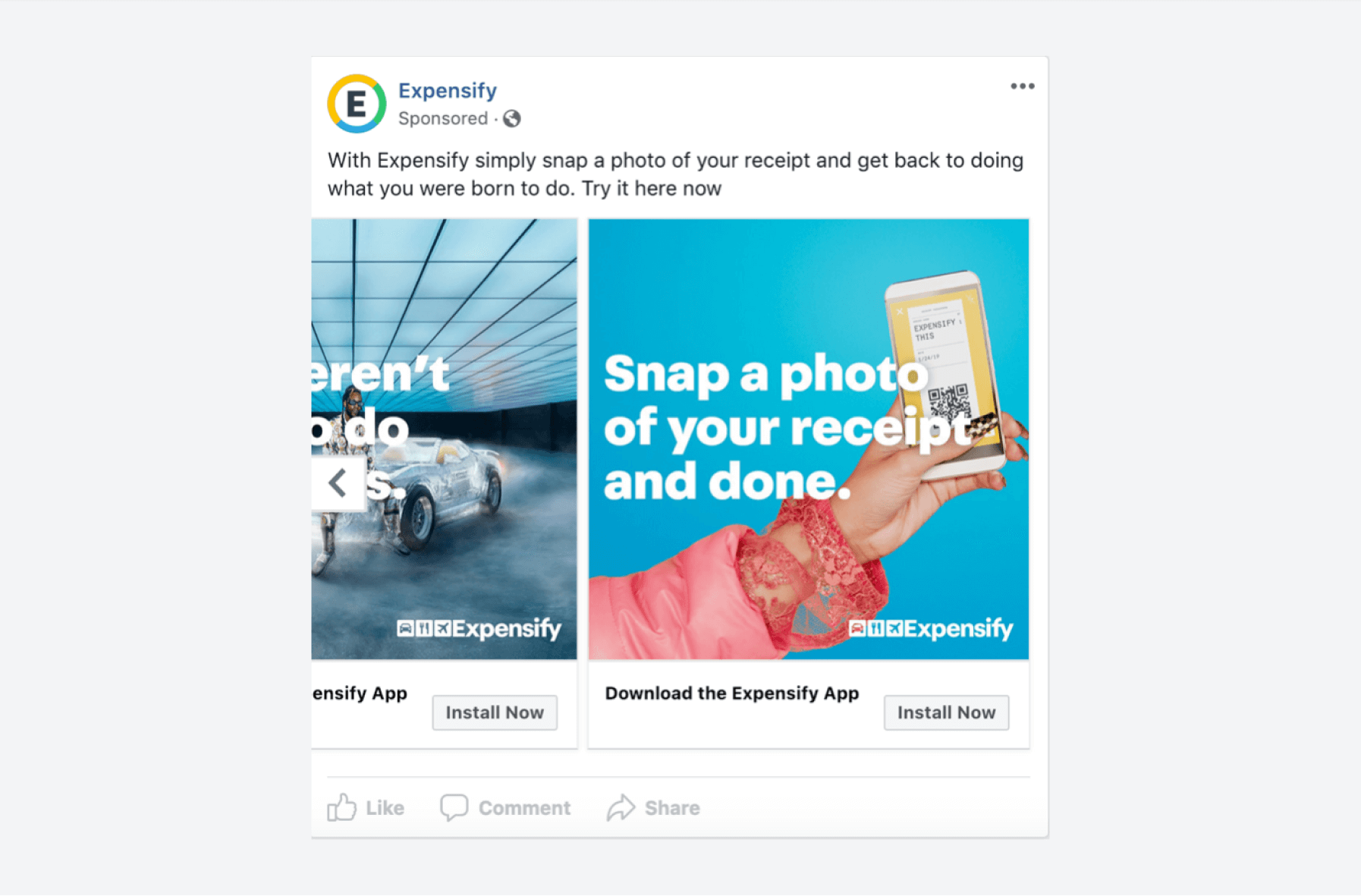
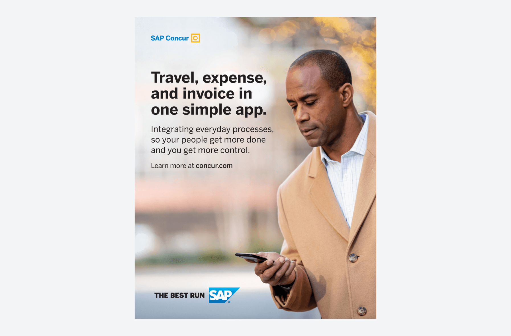
I also analyzed competitor designs to uncover the strengths and weaknesses of their approaches. The competitor analysis revealed that while the visuals placed a heavy emphasis on aesthetics,
they did not clearly illustrate the app's functionality. Additionally, the use of generic stock imagery failed to effectively engage or inform the audience.
Design Approach
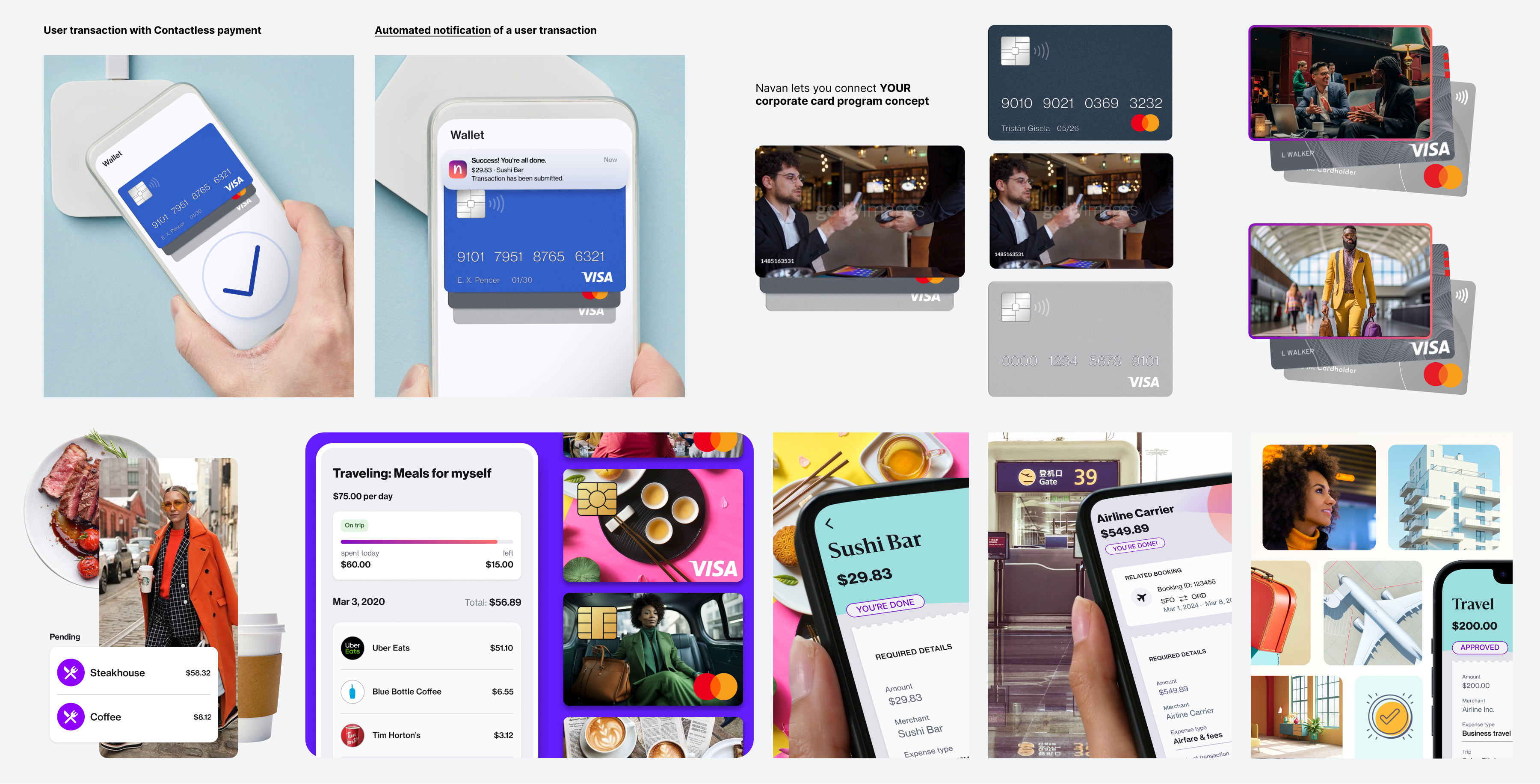
My challenge was to create visual concepts that clearly and engagingly convey expense management while maintaining the brand's desired aesthetic and tone. This approach needed to align with the campaign objectives by employing visual storytelling to enhance the message. My aim for the graphics was to effectively address the automated approval process, expense status, and policy.
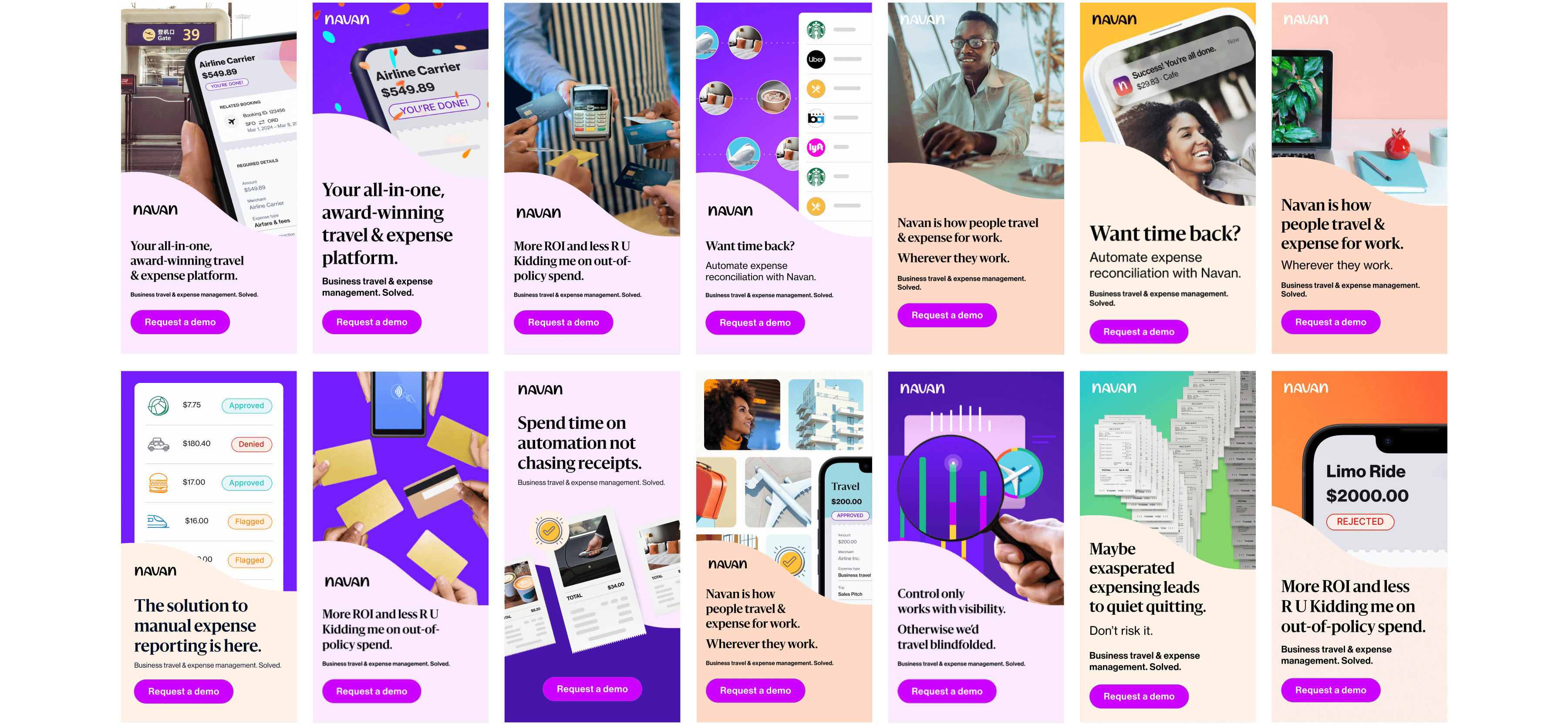
In collaboration with team members and the project lead, I gathered feedback on the designs to make iterative improvements, aligning them with customer expectations and enhancing the message. To maintain consistency and strengthen brand identity, I ensured all visual elements aligned with the brand’s visual identity. Additionally, I created design variations for A/B testing to determine which designs worked best.
Key Design Elements
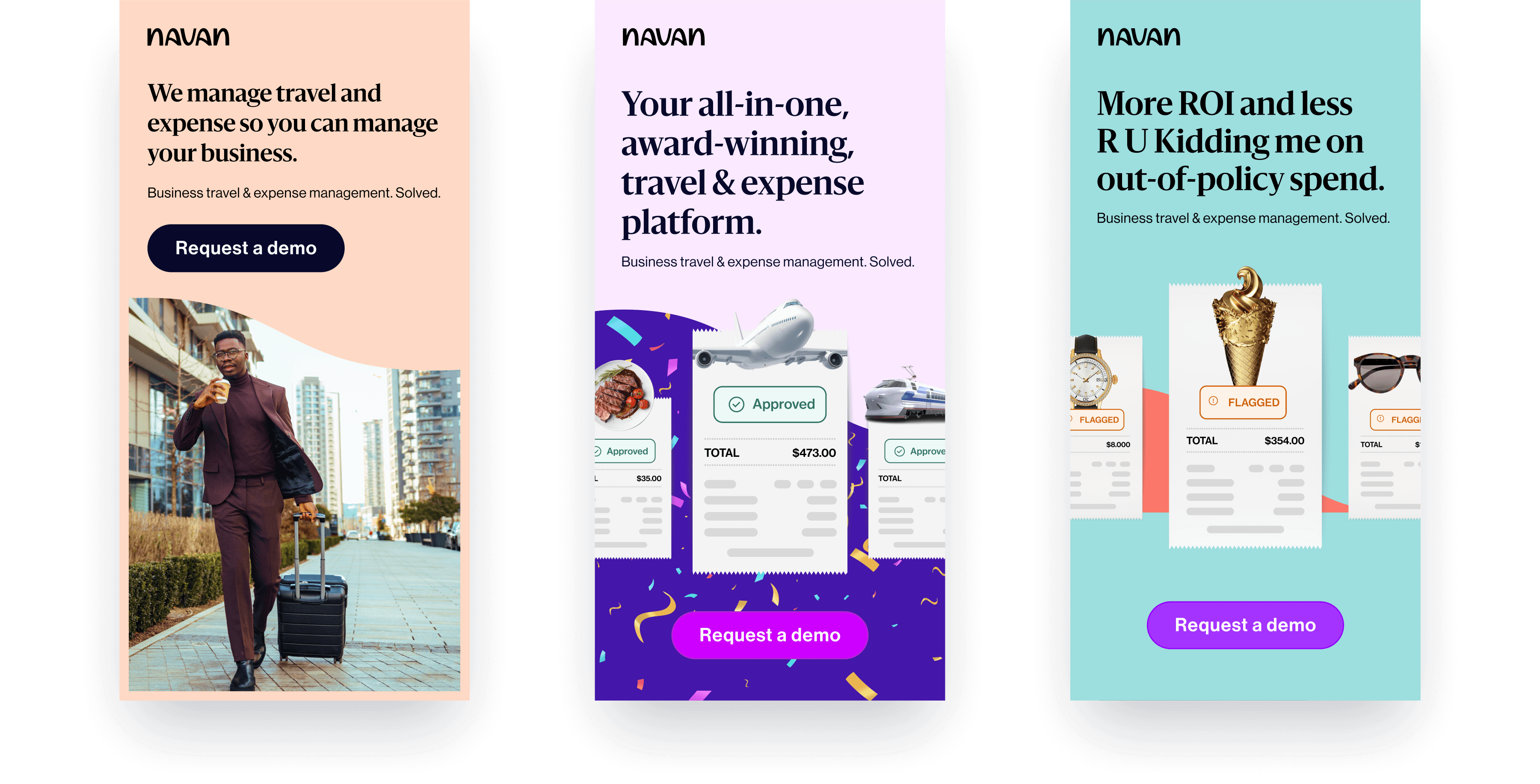
The visuals emphasized key benefits such as time efficiency, ease of use, and reduced administrative burden. These highlights connect to how automated expense management systems are designed to streamline and simplify the process of managing business expenses, effectively addressing several key pain points for business travelers.
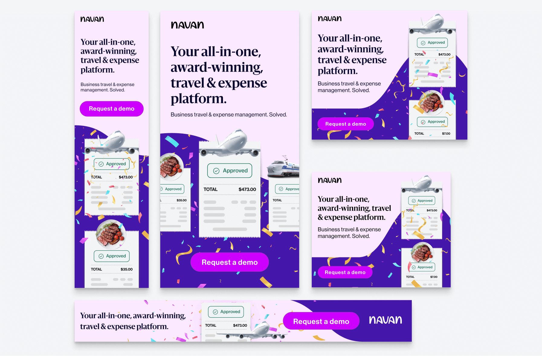
The middle ad includes three large icons representing different aspects of travel: a meal, a plane, and a high-speed train. Each icon is accompanied by a digital receipt that shows an "Approved" status, indicating the platform's ease of use and automated approval process. The receipts display varying amounts, emphasizing the platform's capability to handle different types of expenses seamlessly.
Overall, the ad uses a clean and modern design, with a focus on simplicity and ease of use, aiming to attract business travelers looking for an efficient and hassle-free travel and expense management solution.
Adaptation and Finalization
Once a design was selected, I adapted it to various banner ad sizes, making necessary layout adjustments to optimize the design for each specific dimension.
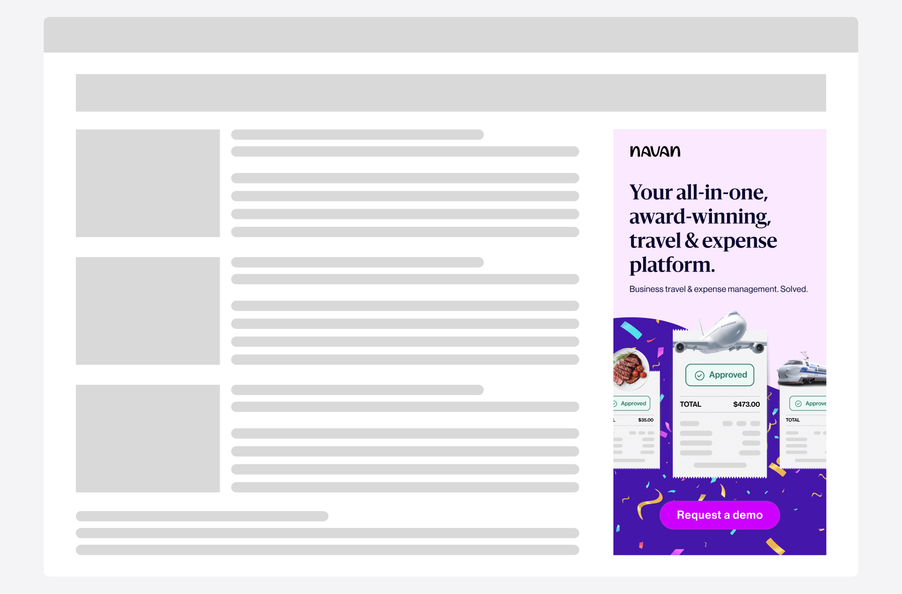
Additionally, I created contextual mockups to present the visual concepts to the team, providing a more accurate assessment of user interaction and engagement.
Conclusion
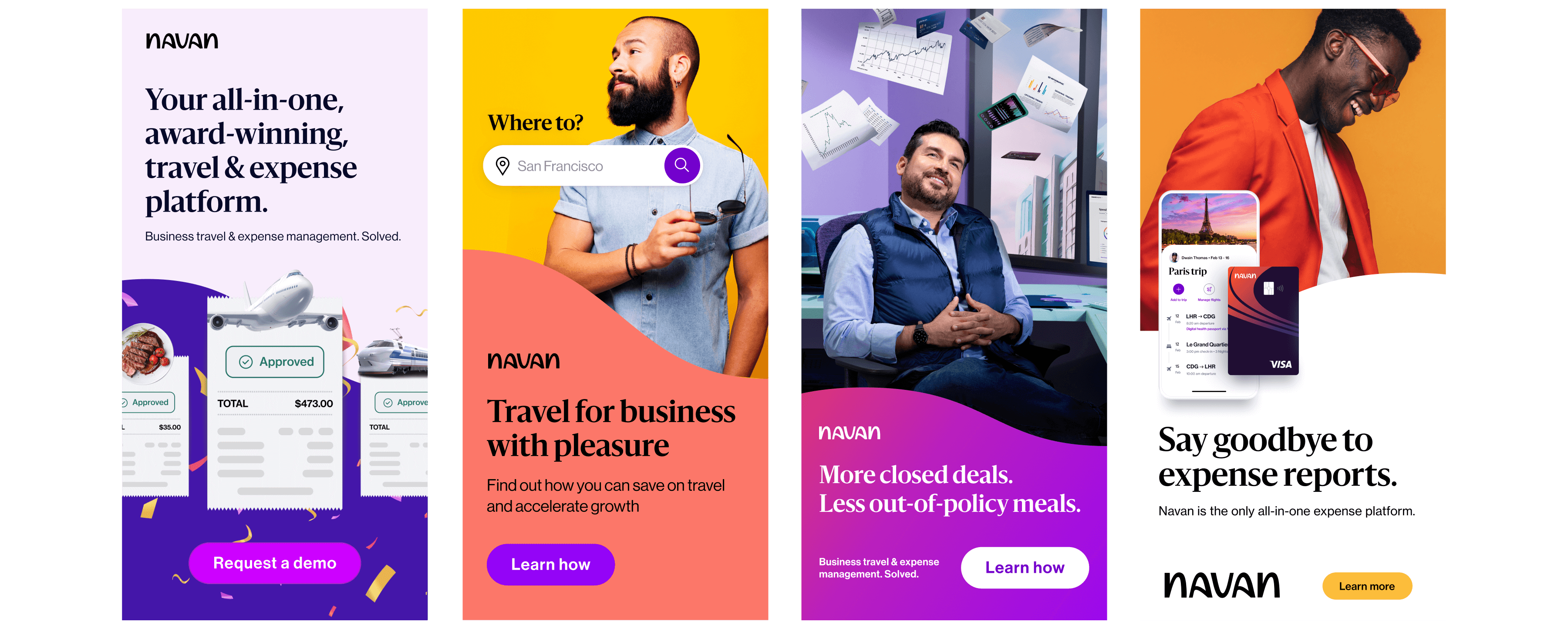
The brand’s visual identity is characterized by vibrant colors, modern typography, dynamic imagery, and clean, layered compositions. The design style is energetic and engaging, aiming to capture attention while maintaining a professional and approachable feel.
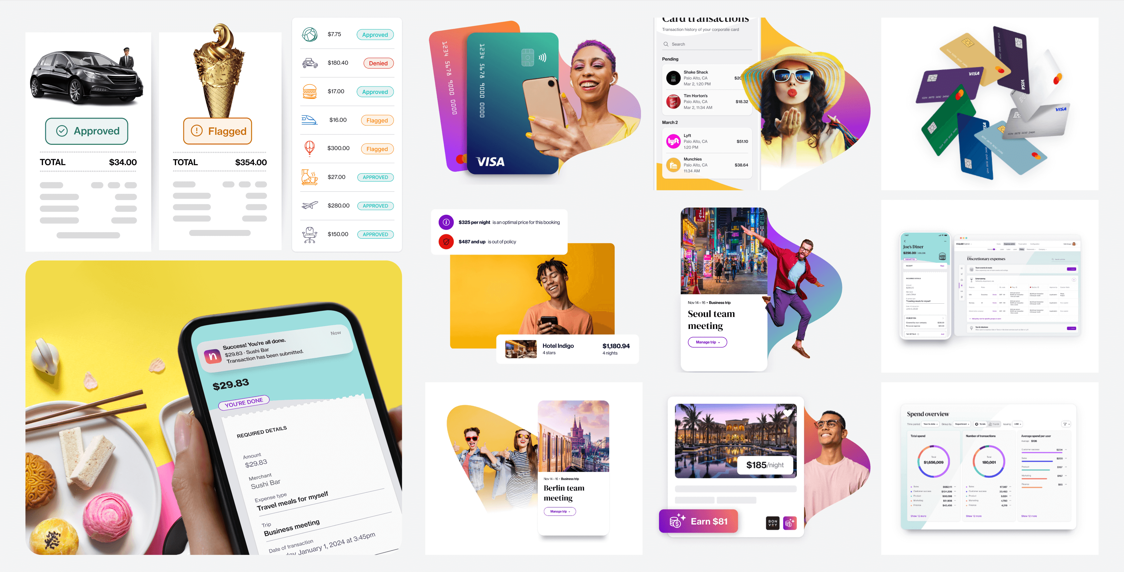
The visual language is consistent to ensure strong brand recognition. All the elements come together to create a unified visual language that is easily recognizable.
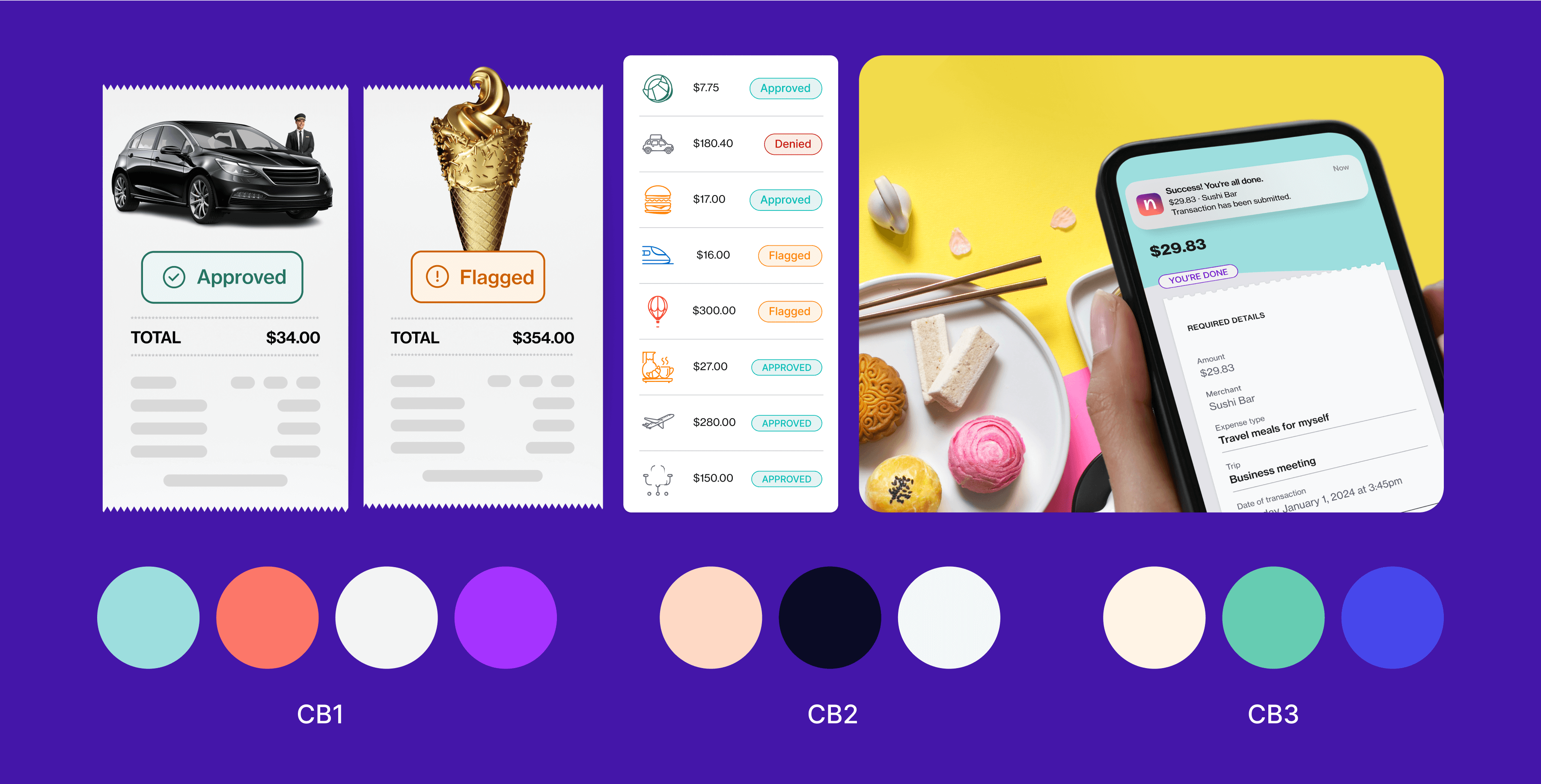
Additionally, I contributed new conceptual graphics to the visual asset library that effectively convey Navan’s expense management solution for business travelers. My contributions were designed to enhance the brand's visibility and stand out in the competitive market. They also aimed to effectively communicate the value propositions of a “seamless travel experience” and “no expense reports.”
This project demonstrates my ability to create visually compelling and strategically aligned marketing materials that enhance brand recognition and drive user engagement.