Elevating Mortgage Underwriting UX with Strategic Visual Audits and Design Systems
Project Overview
This combined use case details the process of conducting a visual design audit of the mortgage underwriting UX flow and developing a new design system to enhance the overall user experience. The design system focuses on improving data tables for displaying detailed loan information, payment schedules, and amortization tables.
Problem Statement
The mortgage underwriting UX flow had significant design usability issues, leading to user frustration and inefficiencies. Additionally, the existing design system was affecting the clarity and usability of crucial loan information.
Role and Responsibilities
As the product designer, I was responsible for conducting a visual audit to identify and document design issues in the mortgage underwriting process. This involved examining each step to ensure consistency in fonts, colors, button styles, and spacing, as well as noting usability issues such as unclear labels, crowded interfaces, and non-intuitive navigation.
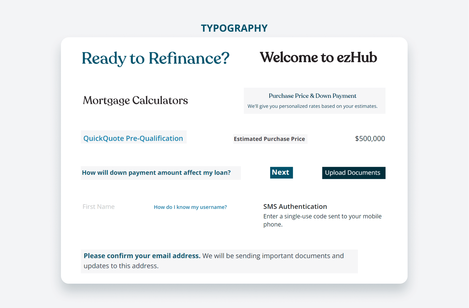
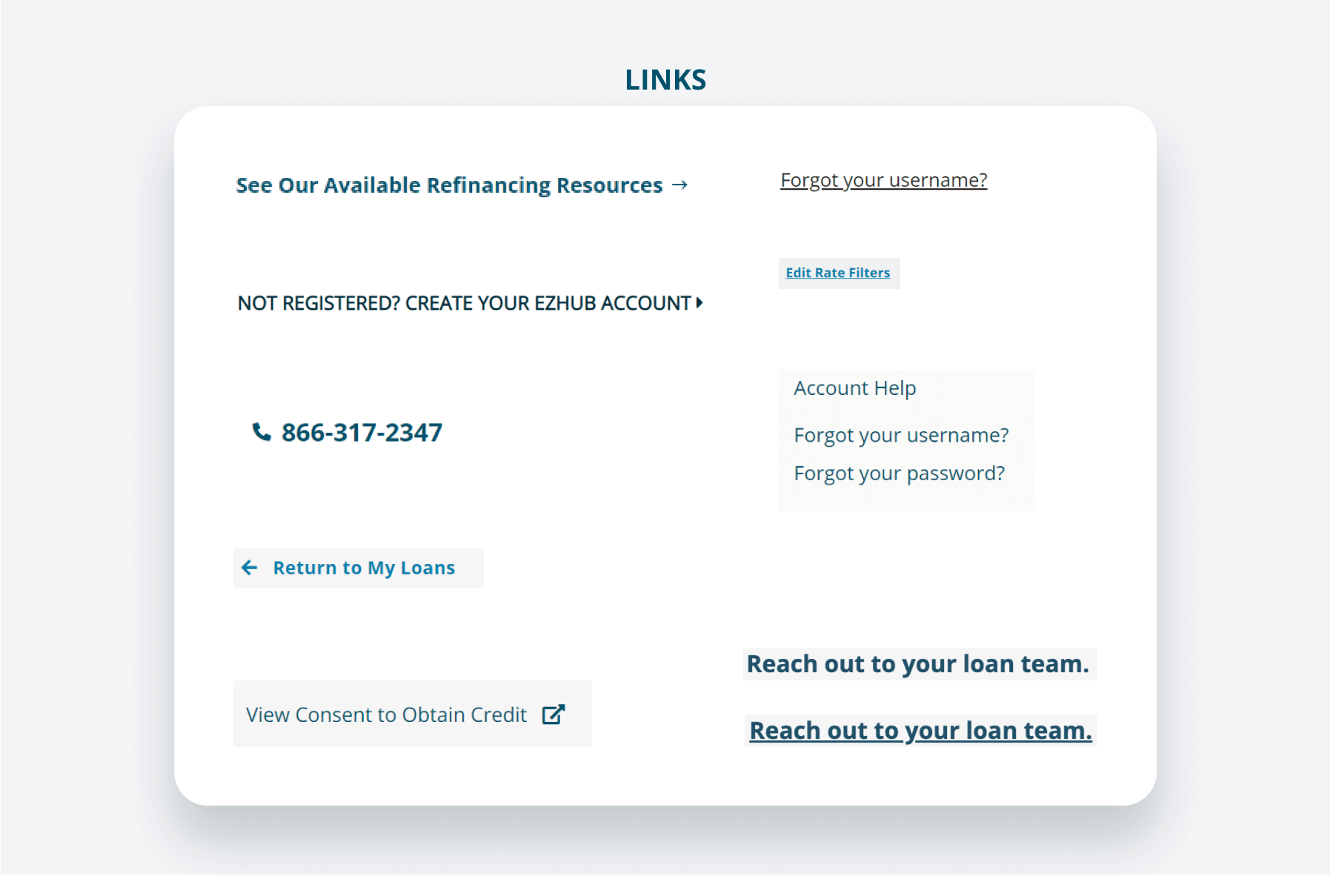
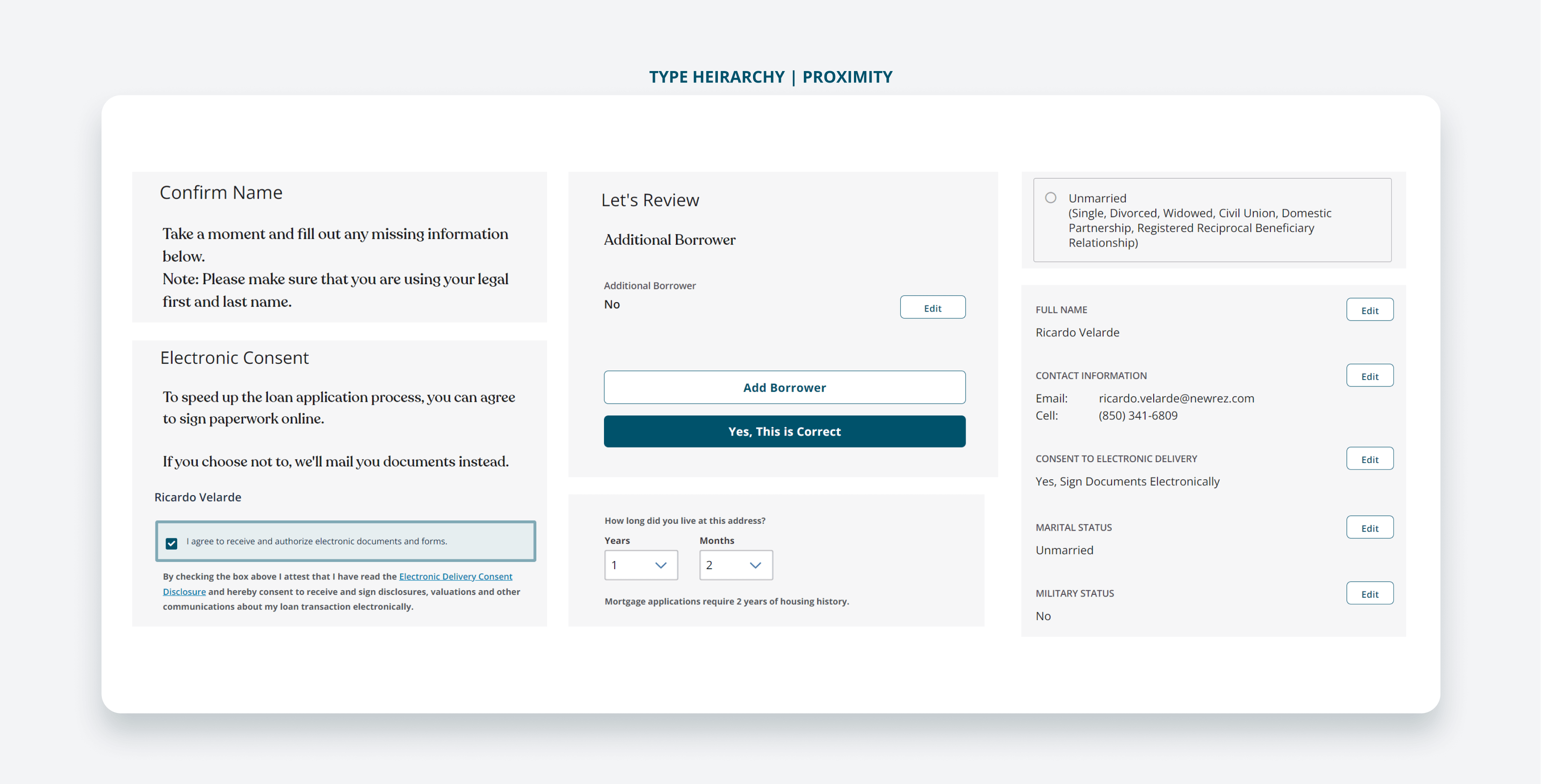
Findings from the Visual Audit
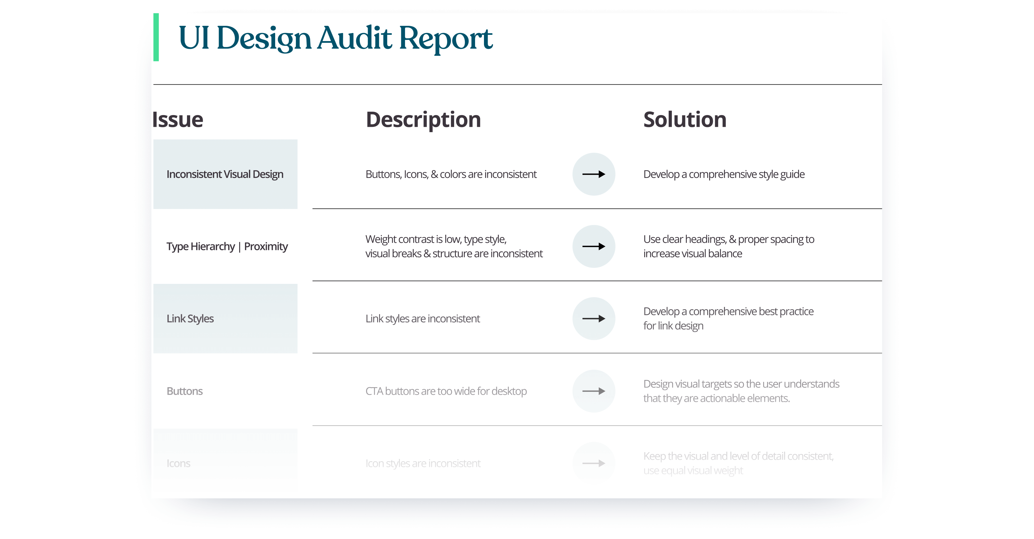
Inconsistent visual elements included variations in font styles, color usage, and button designs, leading to a lack of visual coherence that negatively impacted user engagement.
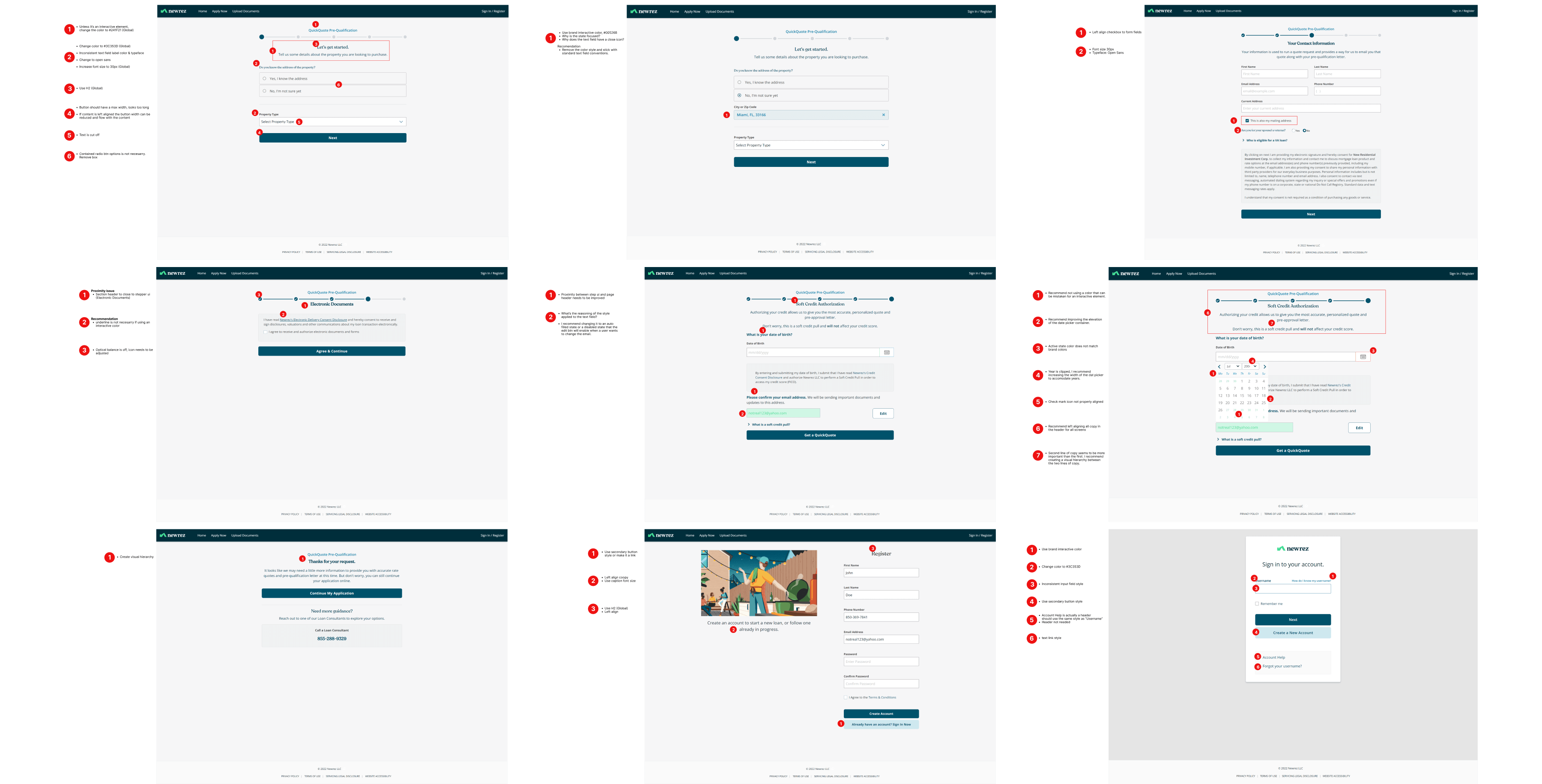
Documentation
I captured screenshots of each step in the underwriting process and annotated them to highlight identified issues. I then compiled a detailed report documenting all design inconsistencies and usability issues, including the screenshots and annotations.
Reflection
This project highlighted the importance of regular design audits and user feedback in maintaining a high-quality user experience. It also underscored the value of cross-functional collaboration in resolving design issues efficiently.
Improving and Optimizing the Data Table Design of the Broker Portal
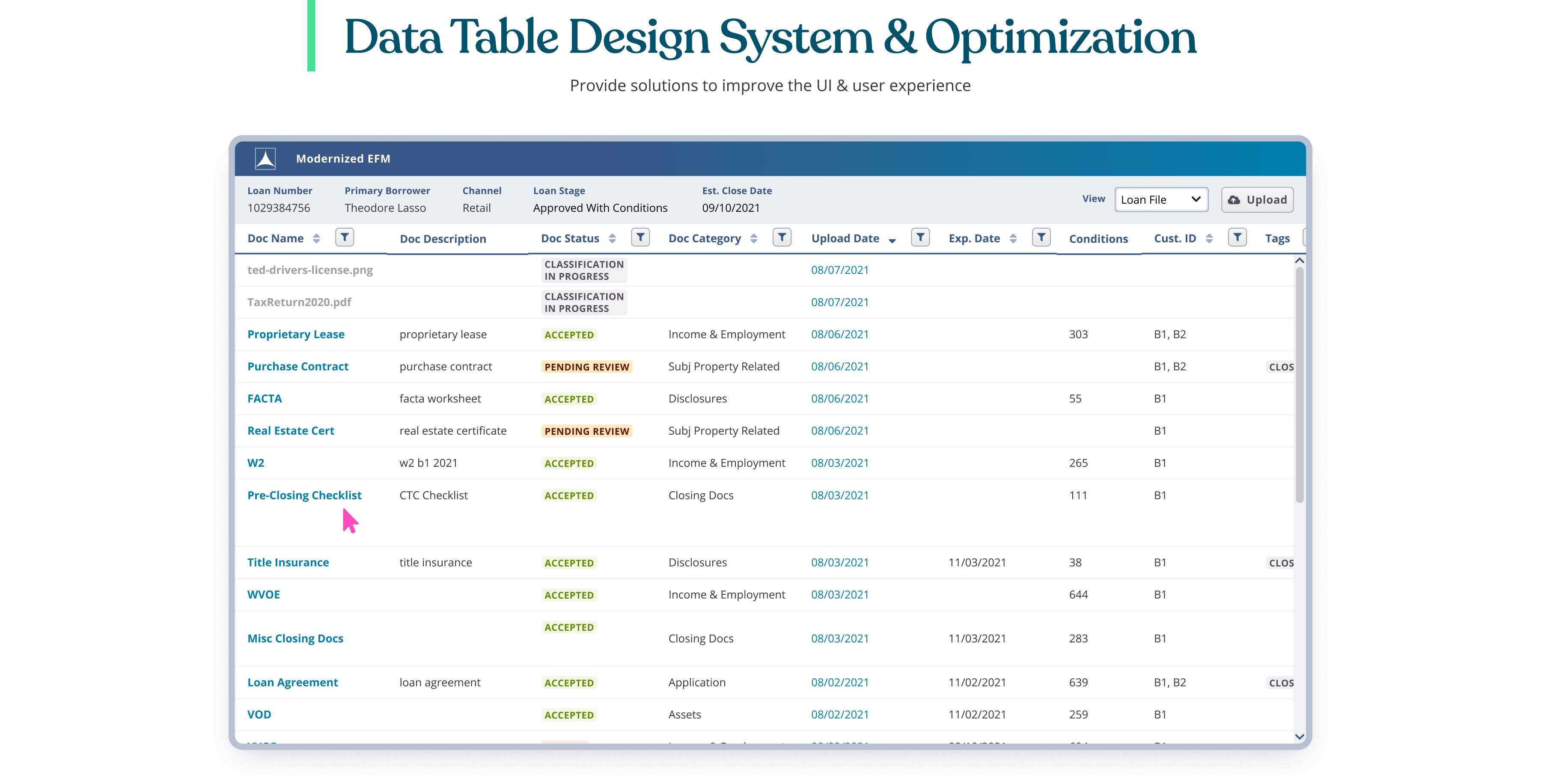
In today's fast-paced financial environment, mortgage brokers require efficient, user-friendly tools to manage and process complex loan information. The data table in the Broker Portal plays a crucial role in this process, serving as the central hub where brokers review, manage, and track loan documents and statuses. However, as the volume of data and the need for rapid decision-making increase, it becomes essential to continuously improve and optimize this data table to enhance usability and overall user experience.
This initiative aims to redesign the data table in the Broker Portal, addressing several key areas to ensure clarity, consistency, and functionality. By implementing best practices in UI/UX design, we can make the data table more intuitive and effective, ultimately improving the efficiency of brokers and reducing potential errors. The following sections outline the specific improvements and optimizations that will be made to achieve these goals.
Role and Responsibilities
As the product designer, I was responsible for developing and implementing a new design system, with a specific focus on enhancing data tables to improve user experience and team collaboration.
UI Components for Data Tables
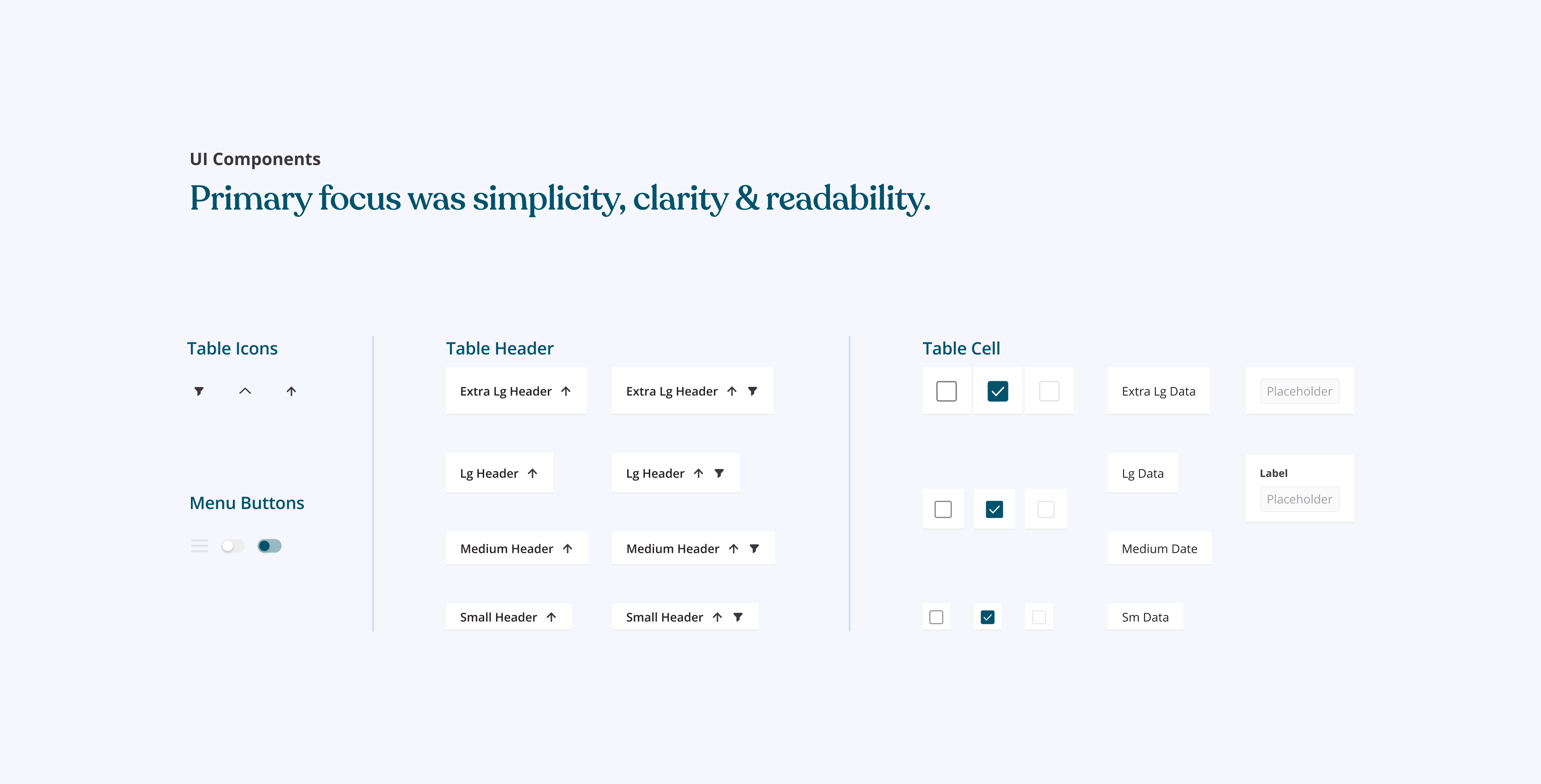
Creating a design system for a broker portal involves establishing cohesive design principles, components, and guidelines tailored to the mortgage industry's unique needs. My primary focus was on simplicity, clarity, and readability to ensure data is presented clearly and understandably. To maintain uniformity, I created a library of reusable components, including enhanced data tables, ensuring consistency and scalability. Standardizing elements such as headers, row spacing, and borders helped create a cohesive and user-friendly interface, enhancing the overall user experience and ensuring consistency throughout the portal.
Rows and Columns Guide
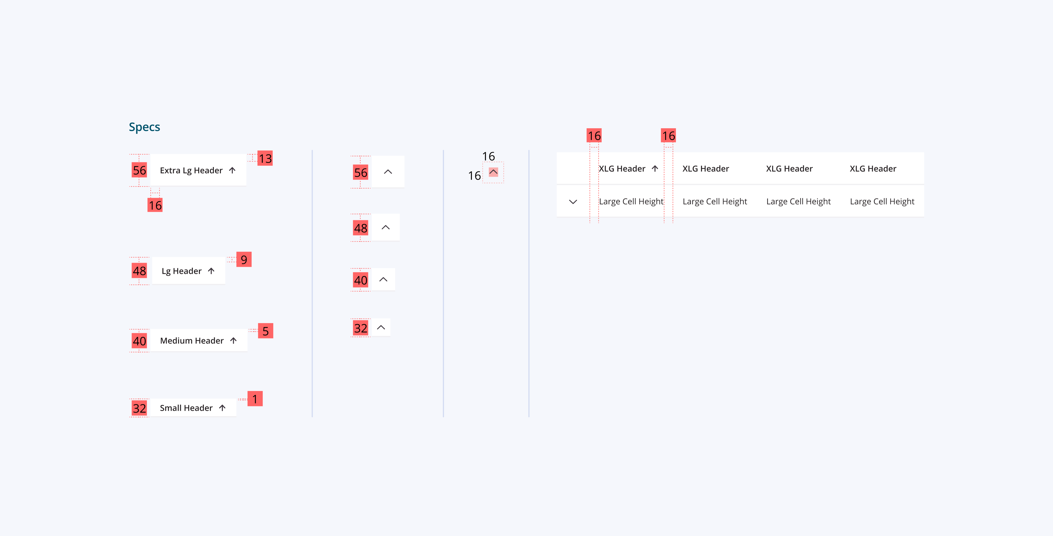
The Rows and Columns Guide is a fundamental component of the new design system for the broker portal. By standardizing the sizes and styles of table elements, this guide enhances the user experience and supports efficient design and development practices. It ensures data is presented clearly and organized, making it easier for users to scan and understand information. Different cell sizes cater to various data density requirements, maintaining readability and usability. Consistent table elements across the portal foster familiarity, reducing cognitive load and improving overall user experience. Consistent spacing rules for margins, padding, and element spacing ensure a clean and organized layout.
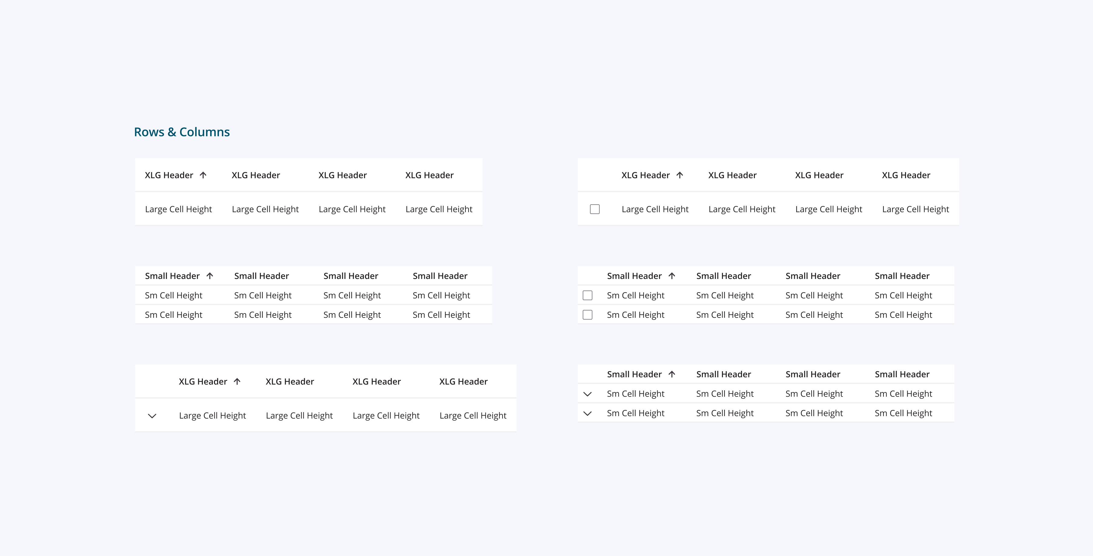
Extra Large (XLG) Header and Cell Height
Extra Large (XLG) Header and Cell Height are suitable for tables requiring prominent headers and spacious cell heights. This design is ideal for sections where detailed information and user interaction are critical.
Large (LG) Cell Height
Large (LG) Cell Height provides ample space for content, ensuring that data is easily readable. Useful for sections with moderate data density, balancing space and clarity.
Small (SM) Header and Cell Height
Small (SM) Header and Cell Height is optimized for high-density data tables where space is a premium. Ensures that even with smaller cell sizes, the text remains legible and interactions remain intuitive.
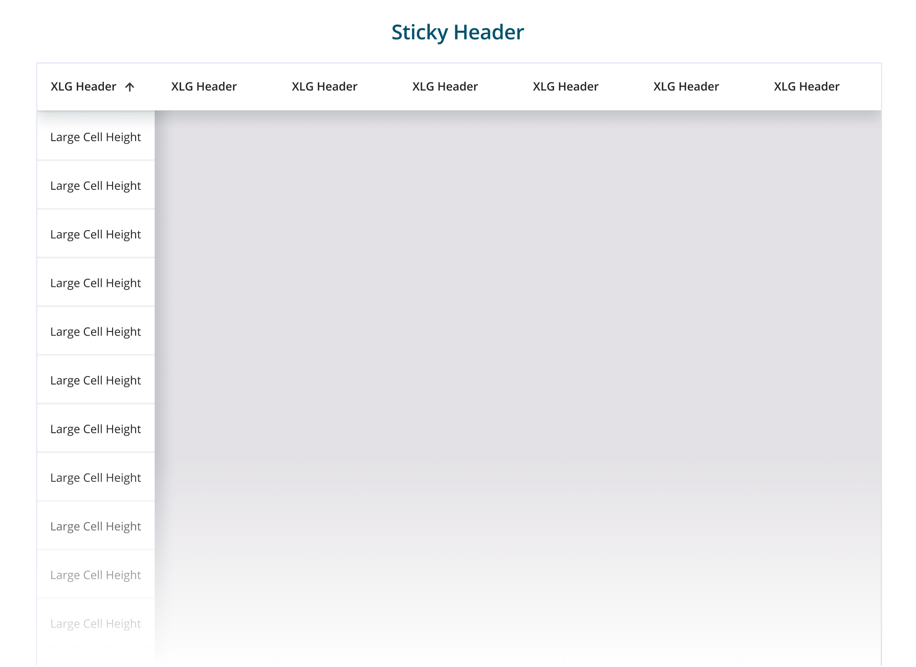
Sticky Headers
I ensure headers are sticky for tables with extensive vertical scrolling. This improves usability by keeping crucial information visible, making it easier for users to understand and navigate data. This design choice reduces cognitive load and enhances the overall user experience by providing consistent reference points as users scroll through large datasets.
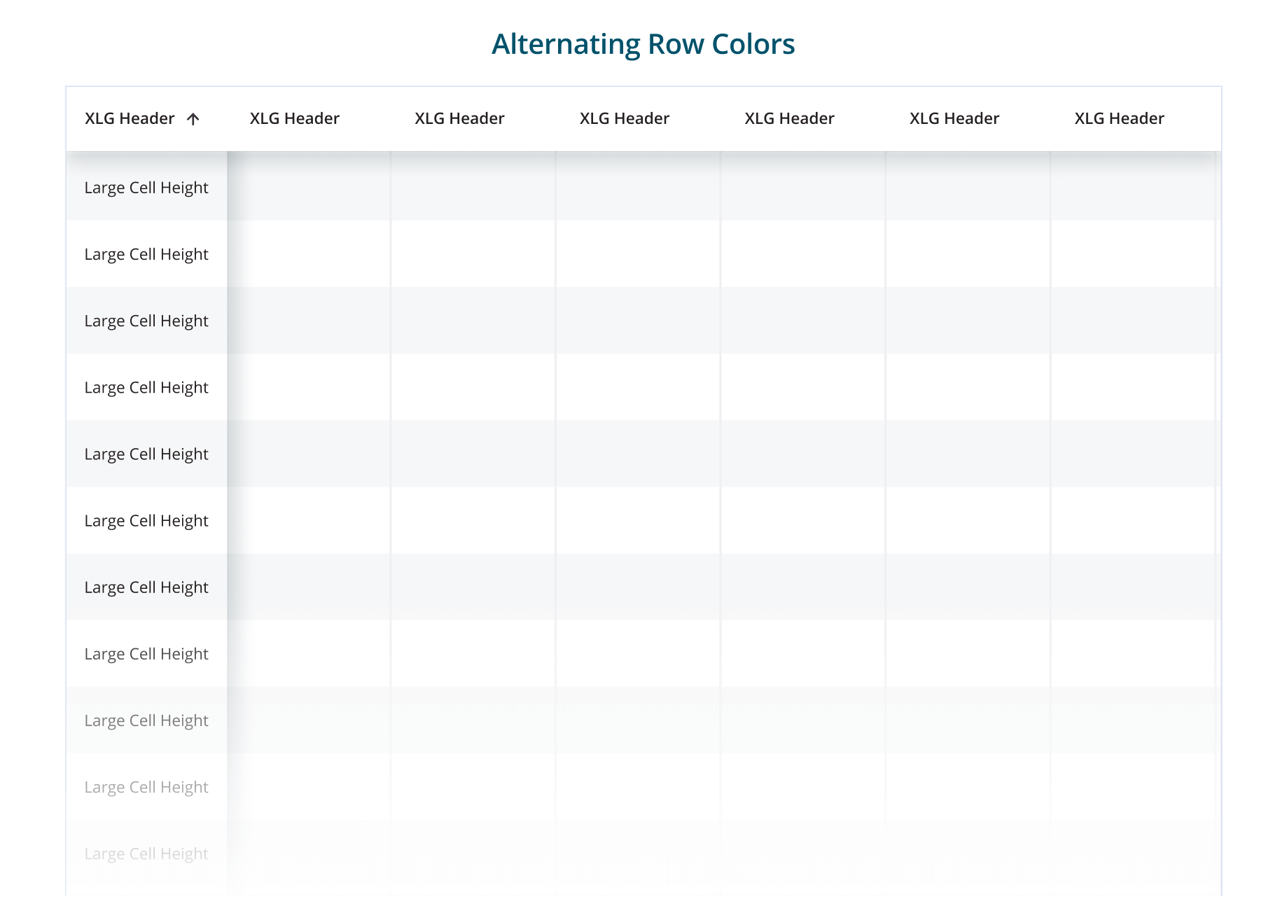
Alternating Row Colors
I enhance readability by using alternating colors for rows. This approach is beneficial because it helps users easily differentiate between rows, reducing visual fatigue and making data scanning more intuitive. Alternating row colors create a clear visual distinction that guides the user's eye across the table, improving overall usability and ensuring that information is quickly and accurately understood. This method also adds a layer of visual interest, keeping the interface engaging without compromising clarity.

Row Hover State
If the table rows do not use alternating colors, implementing an effective row hover state is crucial to help users visually scan columns of data. The subtle visual feedback helps users track data across rows more effectively, enhancing readability and usability without the need for alternating row colors. This approach ensures a consistent, accessible, and visually appealing design.

Status Indicators
Optimizing the design of the data table by using colored labels for statuses, such as green for accepted, orange for pending review, and red for error, significantly enhances usability and readability. These visual status indicators allow users to quickly scan and understand the state of each item, improving efficiency and reducing the likelihood of errors. By providing clear, color-coded feedback, the overall user experience is greatly improved, making the table more intuitive and user-friendly.
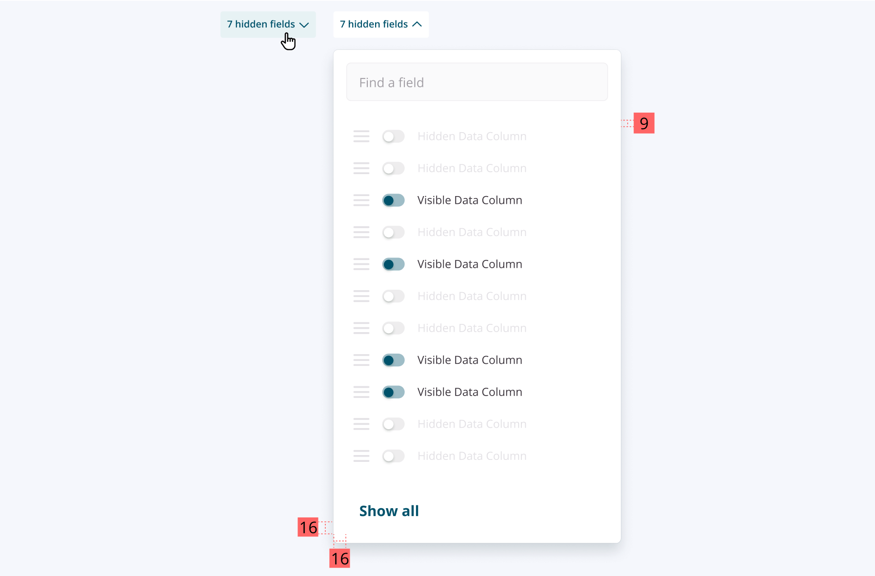
Showing and Hiding Columns Using a Filter Menu
Implementing a show/hide column feature using a filter menu in data tables significantly enhances the user experience by providing customization and flexibility. This feature allows users to tailor the table to their specific needs, improving readability and focus by reducing clutter and highlighting key information. Additionally, it optimizes screen space, especially on smaller devices, and offers a consistent interaction pattern that is easy to use and understand.
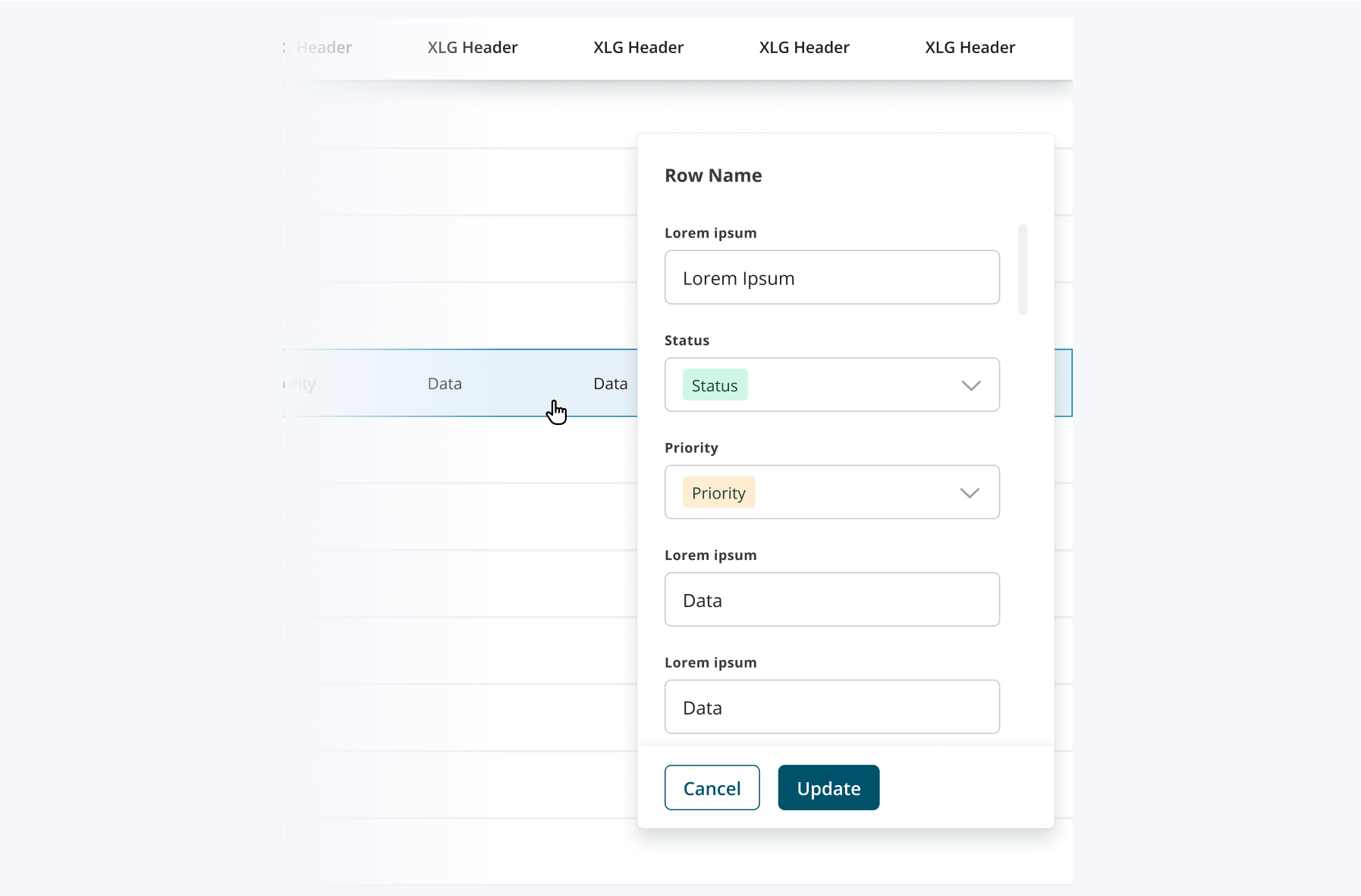
Using a Sidebar for Inline Editing
Implementing a sidebar for inline editing within tables transforms the user experience by offering a focused, dedicated workspace for data entry and updates. This approach enhances usability by clearly separating the editing process from the main table view, reducing distractions, and maintaining context. With expanded input fields and advanced editing features, the sidebar ensures a user-friendly and efficient editing process, making it easier for users to manage and update their data accurately.
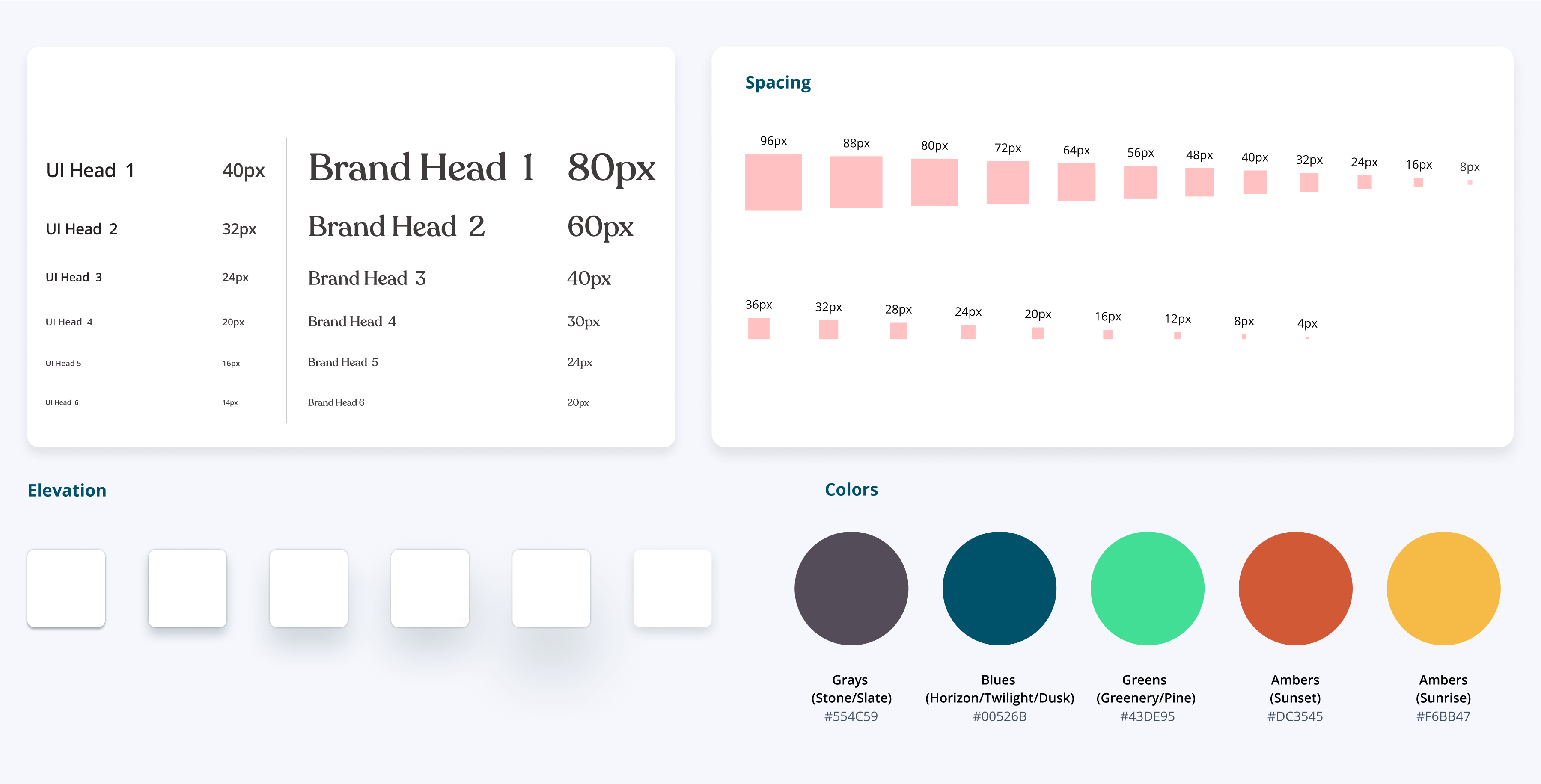
Style Guide
To ensure consistency and enhance the user experience across the Broker Portal, the Estate style guide sets the standards for typography, spacing, color usage, and elevation, creating a cohesive and user-friendly interface. By adhering to this style guide, the design of data tables in the Broker Portal achieves a high level of visual harmony, functionality, and accessibility, ultimately enhancing the overall user experience.
Conclusion
This case study illustrates the critical role of thorough visual design audits and the development of a robust design system in enhancing the user experience within the mortgage underwriting process and the Broker Portal. Implementing a comprehensive design system—including standardized UI components, spacing guidelines, and color-coded status indicators—enhances the readability and usability of detailed loan information while also supporting efficient design and development practices. Features like sticky headers, alternating row colors, and intuitive filtering and editing options further contribute to an optimized, user-friendly interface.
Overall, this project underscores the importance of regular design audits and user-centered design principles in maintaining high-quality digital experiences. The enhanced data tables and consistent design elements facilitate better decision-making and increased efficiency for mortgage brokers, ultimately driving improved user satisfaction and productivity.